Monday, September 26, 2011

THE TIFF


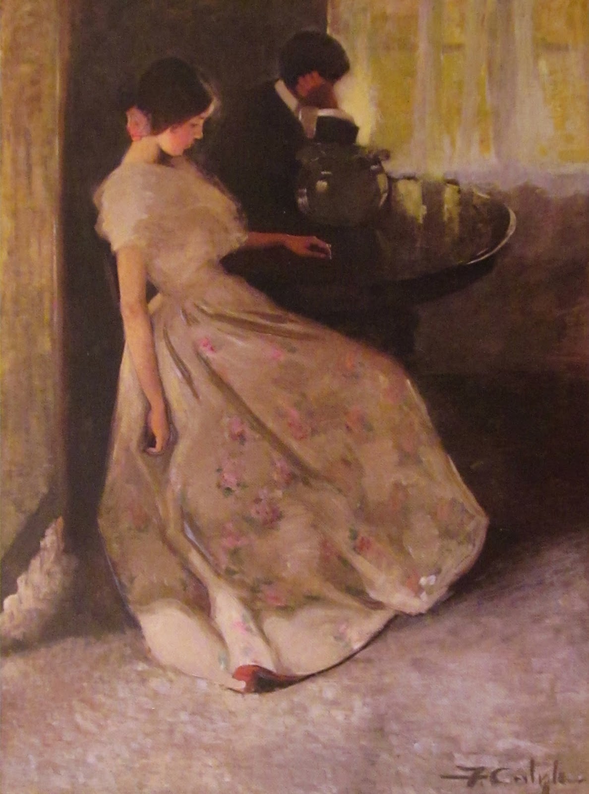
(The Tiff, Florence Carlyle, 1902, Art Gallery of Ontario, Toronto)

Two lushly attired young people sit at a table in Florence Carlyle's "The Tiff."

The room they are occupying is finely decorated.

Silky white curtains drape dreamily at the sunlit window in the background.

The floor is covered with a plush rug in shades of dappled gray and white.

A magnificent painted bowl sits in the center of the tray topped table.

We might easily conclude that the families of this couple come from money.

And we would most likely be right.

But there is something amiss in this painting.

The young man, his head propped up by his right arm, faces the window.

Away from the young lady.

She sits languidly, head down, with her right arm hanging heavily like a dead tree limb.

Hmmm. 

Their body language speaks volumes, doesn't it?

This artwork brought widespread success to Carlyle  in 1902.

That was the year she received the Ontario Society of Artists prize for this engaging but puzzling work.

Let's examine the painting a little further.

I don't know about you, but I  am instantly drawn to the young woman's gorgeous gown.

What woman in her right mind wouldn't want to be seen in a frock such as this?

It oozes glamour and femininity!

Generally, I am not a lover of pink.

But I'm making an exception in this case.

Look at those huge lavender/pink roses scattered over the skirt of her gown.

They bring a bright blush of color to this tonally subdued painting.

I love the coral/pink lining which is seen barely turned up at the hem of her dress.

That peek of vibrant color makes me believe that the dress would be just as beautiful if it was worn inside out!

The young woman's raven hued hair is pulled back into a knot at the nape of her neck.

One perfect pink rose rests upon the knot as it serves to highlight the beauty of her head.

It also acts as a fashion exclamation point for the gown itself.

The gauzy bodice seems to drift like cotton candy in the air.

This is a dress to behold!

Carlyle won the OSA prize for:

1.  the masterly painting of the dress

2.  the ease of the figural arrangement

and

3.  the subtlety of interpretation

Let's take a closer look at that third point.

There is a lot unsaid in this painting.

Mystery abounds.

For starters, we do not know the exact relationship between these two people.

In addition, we don't know the reason for the couple's quarrel.

Even the domestic interior is a little fuzzy - literally and figuratively speaking.

Recently, I read that Carlyle had a "taste for the unresolved."

I think we can agree with that assessment.

Florence gives little insight into the exact meaning of her painting.

The artist wants her viewers to "fill in the blanks" for themselves so to speak.

Does that fact - if it is true - devalue the meaning and purpose of this work of art?

Obviously not.

Instead, it more than likely heightens our interest.

******

A month after Bob and I became engaged we had our first serious tiff.

It wasn't a lot of fun.

But we decided to act like mature adults and discuss our differences until they were resolved.

Talking together, after all, is what brought us together in the first place. 

And we're still yakking it up after 40 plus years of discussions, differences and marital negotiations.

Accord can be achieved.

But it takes two willing participants to get the job done.

And each one of the "discussees" will be humbled in the process.

These are the some of the many seeds that sow a successful relationship.

Perhaps our young friends in Carlyle's painting haven't discovered these truths yet.

Bowing to the artist's wishes, I'm going to create my own resolution for this distraught pair.

In my world, this handsome couple will come to a meeting of their minds.

And their bruised hearts as well.


Note:

(The following information is taken from the website of the Art Gallery of Ontario in Toronto.)

The OSA prize carried with it considerable renown and "The Tiff" was bought by the Ontario Provincial Government for $1000.  Subsequently, in 1904, shown in the Canadian section of the St. Louis World's Fair, the painting received a silver medal, outdistancing the work of Carlyle's outstanding and successful male compatriots in the same exhibition.  

Florence, you rock!


Tuesday, September 20, 2011

THE LITTLE WORKER

(The Little Worker, Helen Galloway McNicoll, 1907, Art Gallery of Ontario, Toronto)


My favorite color in the whole wide world is blue.

But let me tell you something.

Yellow is right up there next to it.

In fact, my favorite color combination of all time is blue, white and yellow.

Whenever I see these colors together they make my heart zing.

Why?

When they're mixed up in a nice big batch of paint on a canvas they come out looking as fresh as a field daisy in early spring.

No one had to convince Canadian painter Helen Galloway McNicoll of that fact.

Her lovely Impressionist piece, "The Little Worker," is filled with a brilliant field of sunny, shimmering yellow.

Oh, there's certainly shades of creamy white in this painting.

And a liberal dose of  blue-green tones are used here as leafy ground cover.

Done!

My favorite colors are all present and accounted for.

Look closely and you'll see specks of pink, red and lavender in Helen's field of dreams.

These random dots of color add a punch of excitement to her golden field.

We could even say that without those dots of color Helen's field might not look nearly so golden.

A little opposition - especially in the world of color - can be a very good thing.

Our little worker seems to be walking downhill, doesn't she?

In a field filled with willowy stems of bright yellow.

She's going about her daily business.

Because work on a farm is relentless.

What is she carrying in that metal pail?

Milk?

Animal feed?

Or something else.

It's not important that we know.

That outstretched arm - straight as a stick - tells us that the pail's contents are a bit of a burden for her.

She needs to balance the weight of that pail with her rigid right arm.

A small fist is clenched tightly at the very end of that arm.

More proof that her pail is heavy.

The little worker, her head cast downward, concentrates on each step as she navigates through the field.

One stumble on a pesky rock or a long forgotten tree branch and she is a goner.

The conscientious worker and her precious pail will tumble down the hill.

She'll be back to square one, needing to do whatever it takes to refill her pail and get it safely transported and properly delivered.

Yes, work on a farm is relentless.

But it's also filled with the joys of nature.

McNicoll helps us understand the charms of outdoor life in two important ways.

First, just look at those waves of golden reeds undulating in the air!

They're moving every which way in that field.

I can't help but think that our little worker is grateful for the summer breeze that's kissing her pink cheeks.

The fresh, billowy air cools her flushed face if only for a minute.

Secondly, our little worker isn't tending to her duties by herself.

She's got friends keeping her company in the field.

Three chickens have decided to tag along on this adventure as well.

Hmmm.

I'm a little suspicious.

If she is carrying feed of some sort, could bits of it be splashing onto the ground as she walks?

If so,  those chickens aren't really social butterflies at all.

They are creatures of nature doing what comes naturally!

And isn't that true of every animal on earth?

No matter how much we love and adore them, our animal friends will always be doing animal-like things.

Still, that doesn't mean that our friendly beasts don't like to be with us.

Because they do.

No matter what their motivations may be, they enjoy hanging around their human buddies.

That's a good thing for us as human beings.

It's a good thing for our little worker in particular.

The secret thoughts she is thinking as she tramps through that buttery field are her's and her's alone.

That is as it should be.

Still, she's not a solitary creature in her sunny field of work and thoughts.

She's got feathery companions to help lighten her load of work day duties.

And that's a very good thing, indeed.

Tuesday, September 13, 2011

A MEETING OF THE SCHOOL TRUSTEES

(A Meeting of the School Trustees, Robert Harris, 1885, National Gallery of Canada, Ottawa)


There are times when I'm traveling down the walls of an art museum when a painting jumps out at me.

And let me be honest here, this happens A LOT!

These "jump-out" paintings grab something deep within my heart.

They twist and pull on my soul.

When this happens, I have no choice but to pay strict attention to them.

This phenomenon occurred when I first laid eyes on Robert Harris's "A Meeting of the School Trustees."

OH......MY......STARS!

Do I love this painting or what?

First of all, let's discuss my favorite part of any painting......the colors.

This one is full of luscious, earthy tones.

Rich, deep browns.

Mottled tans.

Creamy beiges.

And musty grays.

This painting is a symphony of soft, muted colors.

Why?

Here are a few possibilities:

The folks in this painting aren't what I would call  "fashionistas."

Not by any stretch of the imagination.

They are common, everyday working people.

The school teacher is dressed in typical school teacher garb - consistent with her station in life and her time in history.

If we look closely, we see pleats falling gracefully at the back of her chocolate brown skirt.

A bit of a bustle ruffle sits on top of the pleats.

Thickly woven braiding encircles the collar and cuffs of her jacket.

But that's about it in the "glamour and glitz" department for this young woman.

She is, after all, a Victorian era school teacher.

And one of modest means.

It appears that all four gentlemen are dressed in their Sunday best.

Or close to it.

The room they are meeting in is sparsely furnished at best.

No elegant, engaging art works hang on the nearly empty walls.

There are no sumptuous rugs lying on the floor of this "conference" room.

It's pretty much bare bones all the way around.

Except, of course, for the halo of creamy light surrounding our teacher's lovely head.

Do we really have to guess who's the star of this show?

I think not.

Notice the teacher's left hand.

It is gently stretched forward with the palm and fingers open.

That hands speaks volumes.

It's a tool the teacher is using to help present her case to the trustees.

She seems to be asking the trustees for assistance of some sort.

Could it be a boost in financial support?

That would seem reasonable to assume.

We don't know, of course.

Notice how the eyes of the gentlemen are glued to the teacher.

Obviously, the trustees are listening to the teacher speak.

But look at those three and a half pairs of eyes!

(The fourth trustee's right eye is hidden from us.)

Maybe it's just me, but I don't see a glimmer of hope anywhere in those eyes.

These are sober looking gentlemen to be sure!

The hands of two of the trustees are closed, the fingers turned under and away from the open, inviting hand of the teacher.

I think it's safe to assume that our imploring  schoolmarm is having a struggle convincing these trustees to grant her request.

I'm going to go out on a limb here and say that perhaps the gentlemen would like to grant her wish.

But the funds just aren't there to do it.

Again, we don't know the answers to these pictorial mysteries.

We do know that the soft, muted colors used in this painting contribute to the somber tone in this work of art.

By the way, the "conference room" is not a conference room at all.

At least not in the traditional sense.

It is, in fact, the teacher's school room.

How do we know?

Take a minute and study the lower left hand corner of the painting.

A paper binder rests floppily on a makeshift desk.

The edge of the binder is held onto the desk by a small chalkboard.

An open ink bottle sits to the left of the teacher's right hand.

Once again, that hand is vital to the understanding of this piece of art.

The teacher's hand is staking claim to that desk and everything lying on it.

These are the tools of her trade.

They are vital to her work.

And because of that, they are important to her as a person.

In the painting, the struggle to gain assistance from the trustees continues onward.

But this young woman - still in the blush of her youth - will not be easily broken.

And that's what I love about school teachers throughout time and space.

The really good ones live and breathe their profession.

They love to impart knowledge to their students.

Students whom they adore.

Ultimately, their desire is to change young, impressionable lives for the better.

For the better and for always.

Note:

The writing on the floppy binder reads:

ROLL

PINE CREEK 
SCHOOL

KATE HENDERSON,

 TEACHER

Kate, I love you!

You've got it goin' on, girl!

Wednesday, September 7, 2011

COUPLE LOOKING AT A GLOBE

(Couple Looking at a Globe, Lambert Doomer, 1684, Fleming Museum, Burlington, VT)


This lovely work of art will always warm the cockles of my heart.

Just what are cockles, anyway?

Hmmm.

Sometimes ignorance truly is bliss.

When I look at this masterpiece,  I don't really see the couple in the painting.

I see Bob and me.

The gentleman in this picture doesn't look like Bob, does he?

Well, no.

Not unless Bob decides to start wearing a curly, long-locks wig tomorrow.

And lacy, ruffled cuffs.

Naturally, I'd have to check with him first but I don't see that happening any time soon.

And the gentlewoman certainly isn't me on any conceivable level.

Let's see now.

The last time I planted a red posie in my bodice was never.

And I can not stand to wear any type of head covering.

I'd never be caught dead wearing that wrinkled napkin she's sporting.

That said, I've definitely got my eyes on her milky white pearls.

All of them.

Truth be told, I've got a spiffy little collection of these gleaming spheres myself.

Dutch painter, Lambert Doomer, created this work on wood using oil paints.

That accounts for its deep, rich earth tones and its lifelike textures.

Doomer was a student of the great Dutch master, Rembrandt.

Lucky him!

Let me tell you what I really love about this painting.

I love the dreamy, trance-like expression on the gentlewoman's face.

You can't miss her expression.

Doomer has made sure of that by focusing the lightest light directly on her face.

Transfixed, she's gazes at the globe - dare I say? -  lovingly.

Her creamy eyelids are partially closed.

The faint flicker of a smile crosses her rosy lips.

Her beautiful left hand caresses the rim of the globe.

But just barely.

All of these painterly tricks work together to tell us that the gentlewoman has left our presence.

For all intents and purposes, she is in another place.

A place that is far removed from us.

Why?

Study her male companion.

His right hand is holding a set of calipers.

The calipers are pointing to a particular spot on that globe.

A spot that he wants his lady friend to see.

His eyes are gazing longingly at her.

They are not on the globe.

Is he whispering sweet nothings in her ear?

It sure looks like it!

If he is, indeed, speaking to the gentlewoman might he be saying something like this?

"My darling, pack your bags.  I'm taking you away from all this.  Let's take a three week holiday to VIENNA!  If that doesn't suit your fancy, perhaps we could go to VENICE!  Not your cup of herbal tea?  They say VEGAS is lovely this time of year.  I'm leaving the decision up to you.  Please don't tarry long, my sweet.  I must have you to myself!"

Aha!

That's why she has that look of enchantment on her angelic face.

Mr. Wonderful wants to whisk her away to places unknown.

Why?

Because he MUST bask in her radiant glory and worship the ground she walks on for three whole weeks!

Don't ya just love a good old-fashioned romance?

******

Now, then, perhaps I should get my head out of the clouds for a few minutes.

The last time I checked,  I couldn't find a set of calipers in Bob's desk drawers.

He still is and always will be follically challenged.

And highly allergic to ruffles.

Whispering has never been his thing.

But this is what I do know:

Bob owns a globe.

(He keeps it in the garage with the rest of his manly gear.)

And when he turns away from it long enough to say, ""I think we should go to Munich in the spring," I'm besotted to the core.

My heart flutters.

My toes tweak.

And oddly enough......

the dreamy expression on my face looks identical to the dreamy expression on the face of Doomer's gentlewoman.

It turns out that she and I have a lot in common.

The men in our lives have traveling plans.

And they include us.

What more could a wandering girl want?

******

Now for the real scoop on the meaning of Doomer's painting.

This information appeared on the painting's wall plate in the Fleming Museum:

"Lambert Doomer's "Couple Looking at a Globe" is an allegorical representation of Holland's economic success and scientific progress in the seventeenth century.  The woman's pearls are symbolic of wealth from the Far East, where the Dutch had colonized Indonesia and monopolized trade with Japan; the calipers held by the man were a common symbol of scientific study.  The couple touch the globe with a familiarity that suggests the position of dominion that Holland held in the world at that time."

******

Oh, well.

So much for my good old-fashioned romance.

Frankly, I don't much give a hoot about Holland, the Far East or "common symbols of scientific study."

At least, not in this context.

Nope.

I'd rather focus on that romantic glint in our gentleman's eye.

How about you?

Monday, September 5, 2011

THE LETTER

 
(The Letter, James Tissot, 1878, National Gallery of Canada, Ottawa)


I love a good story.

Preferably one that's filled with intrigue and just the right touch of mystery to keep me glued to the pages.

Interject a heavy dose of romance and I'm gobsmacked.

James Tissot's "The Letter" is just such a story.

Umm......painting.

I can't think of a better word to describe "The Letter" than LUSH.

Let's take a minute and dissect all this lushness into bits and pieces.

The setting for this painting is Tissot's garden in London where he lived for 11 years.

Just look at those rich autumn colors!

Maybe your eyes have fallen first on the burnished gold of the drifting chestnut leaves.

Or perhaps it is the emerald green lawn that immediately swept you up and caught your attention.

It's the tomato-ey red vines dripping over the wall-like arbor that rivet me.

What a pop of lush color!

It could be those statuesque urns that snagged your roving eye.

I'm thinking that someone at the Tissot residence has a thing for urns.

How about you?

I counted 17 of them.

There may be more hiding in this gorgeous garden.

The urns lend an air of aged formality to these serene surroundings.

As do their variegated hues of classic gray.

The sand colored pea-gravel pathways are there to calm us.

That's what I think.

Tissot has added them to balance the highly saturated colors in his garden.

As we glance at the upper right corner in the background, we see the painter's man-servant.

He is busy.

Is he setting the table for lunch?

Or removing soiled dishware after the fact?

We don't know.

What we do know is that he is standing in front of a beautiful building with multiple glass windows.

The structure looks like a giant bird cage.

We may be looking at an English conservatory.

Or some sort of lavish greenhouse.

In any case, the operative word here is "lush."

Now let's take a closer look at the lovely lady standing on the lawn.

She's dressed from head to toe in the finest finery.

We gaze at yards of ruffles, lace, netting and taffeta.

All done in silvery grays and dramatic blacks.

Can we say "upper crust?"

It's obvious that she didn't pick up her ensemble at the local "Walmart."

As if there were anything comparable to that in Victorian England.

Our eyes are drawn to her delicately gloved hands.

They are in the act of twisting something small and white.

Is it paper?

We know the small, white object is paper because we see more of the same flying gently in the air around her.

Some of it is behind her right shoulder.

We see more of it at the lower left corner of her frock.

We know that the torn pieces of paper are what's left of a letter.

The artist has kindly solved that mystery for us when he titled his painting.

In the world of art, a favorite symbol of absent or unrequited love is the letter.

In this case, I think we can safely gloss over the "absent" love possibility and head directly toward "unrequited" love.

What do you think?

If this lady's love was merely absent why would she want to shred his letter into a million floating pieces?

Wouldn't she desire to savor it, cling to it and cherish it for future reading?

Undoubtedly so.

We're left, then, with the option of "unrequited" love.

This woman is destroying her suitor's letter.

As she rips the paper apart she gazes to her left.

Could she be thinking of happier times with her beloved?

Or is she thinking of torturous things she would like to do to him for betraying her affections?

(I hate to admit it but that would be my game plan.)

Again, we don't know.

In any case, it's probably safe to assume this woman's romance is officially over.

Haven't we all shared a similar moment in our own romantic histories?

Perhaps it was a letter or a phone call.

Maybe it was an electronic email.

If the gentleman possessed an ounce of class, he showed up in person to announce his parting.

Worst of all, it may have been nothing more than a deadly silence.

However it was done - it hurt.

Our self-esteem was shaken to its core.

For a while, we might have wondered if we could go on living.

In time, our pain subsided.

And we lived to love again.

Ever hopeful we'd never see a second fluttering letter.

Thursday, September 1, 2011

BEAUTIFUL BLUE

(Waterloo Bridge:  The Sun in a Fog, Claude Monet, 1903, National Gallery of Canada, Ottawa)

When I think of the word "serenity,"  I often think of Claude Monet - the masterful creator of ethereal lights and other painterly wonders.

Monsieur Monet was an artistic genius.

It's that simple.

It has been said that his artistry evokes emotions within his viewers that they have seldom felt.

I don't know about "seldom."

But, oh, can he evoke emotion!

While recently gazing at his "Waterloo Bridge: the Sun in a Fog" I fell under his spell once again.

And I was happy to do so.

Actually, I needed to do so.

I've frequently toyed with the idea that Claude Monet was put on this earth to act as a human sedative.

For all of us anxious people who struggle in our grasp for serenity.

And I admit it..

I am one of those people.

So as I stood in the National Gallery of Canada a few weeks ago, I felt my blood pressure literally descend while I was soaking up everything that "Waterloo Bridge" has to offer.

My favorite color is blue.

I'll take it in any tone, shade, shape or form I can get it in.

Greens are good too.

Especially if they are thrown ever-so- lightly into the blues.

"Waterloo Bridge" is nothing if not a big calming splash of turquoisy blue.

OH...MY...STARS!

I'm talking about instant serenity here!

As you look at this painting,  you can see a hazy horizontal slash of deep blue that represents Waterloo Bridge.

You can even notice a few misty archways under the bridge.

And let's not forget the two delicate sailboats floating on the river Thames.

At least I think they're sailboats.

It doesn't really matter.

Thoughtful artist that he is, Monet has placed those things in his painting for our viewing pleasure.

But really now, it's all about that lovely shade of turquoisy blue, isn't it?

Well, yes......except for that golden ball in the sky.

You can't miss that golden ball.

The golden ball is tinged with orange speckled strokes of color.

May I be so bold as to say that Monet doesn't want you to miss his golden ball.

It's what's giving balance, life and beauty to his interpretation of "Waterloo Bridge."

What about the golden strokes of color - also tinged with orange - that lie upon the Thames?

That ethereal golden ball casts a mighty reflection, doesn't it?

Just as it should.

One archway is nearly filled with that watery glow.

Artists know that the color orange is the direct complement to the color blue.

These colors bring life to each other because they are so very different.

Sparkle and life.

Who doesn't need some of that?

So here's what I think:  If that sparkle and life pops up in a gigantic mass of beautiful blue - well, then - I say bring it on!

Because it's the "sparkle" that brings joy to my life.

But it's those beautiful blues that settle serenity within me.

Maybe it's just me, but I can't live a sparkle filled life unless serenity appears on the scene first.

Serenity is the healer.

It sets the stage for everything else.

Especially the joy.

Tuesday, August 30, 2011

THE PRAYER BEAD


(Prayer Bead, Flanders, 1500, Art Gallery of Ontario, Toronto)


This is a prayer bead.

Prayer beads have traditionally been used to help religious worshippers meditate on spiritual matters.

Specifically, this is a Christian prayer bead.

It was created around the year 1520.

Which places it smack dab in the middle of the Renaissance.

Or toward the end of the Renaissance......

depending on which art historian one chooses to believe.

It is said to have been carved in Flanders - the Duchy of Brabant.

That means that its origin is Northern Dutch.

The sculptor created this miracle of art from boxwood.

The bead comes complete with the ability to open and close.

It possesses both a hinge and a latch to allow those movements to happen.

Now for the mind-blowing part:

The prayer bead is 6.4 cm in diameter.

For all of us metric-phobes out there (and that includes me) that means that this bead is two and one half inches in diameter.

If you study both halves of the bead closely you will find that this genius sculptor has carved two Biblical stories into his bead.

The upper half depicts "The Queen of Sheba Visiting King Solomon."

The lower portion contains his carving of "The Adoration of the Magi."

Now I'm going to ask you to do something.

Grab a magnifying glass.

Next, plant your magnifying glass directly over one half of the bead.

Finally, remember that this masterpiece was sculpted in a two and one half inch space.

Actually.....less than that.

If you count the space allotted to the outer rims.

And the circles next to the rims containing the Latin inscriptions.

Is your mouth open?

Is it in gaping form?

Pardon my arrogance but if it isn't it should be.

I stood in front of this minuscule beauty at the Art Gallery of Ontario just weeks ago.

It was lying on a rich velvet fabric.

The color of the fabric was burgundy.

Soft lighting streamed down gently upon it.

Very "Renaissancy," indeed.

The very minute my eyes landed on this piece, I automatically opened my mouth.

More correctly, I stood with my mouth gaping as I viewed its incredible artistry.

Soon my mind wandered to the Renaissance sculptor who possessed the artful knowledge, the refined skill and the long-suffering patience to create this magnificent bead.

Perhaps the sculptor created the prayer bead for his or her own personal devotions.

I'd like to think that anyway.

After studying the bead for several minutes, I decided to move along before any tale-tell tears fell from my adoring eyes.

And that, dear readers, is what art brings to my life.

What does it bring to yours?